
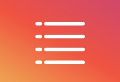
・賢威7で「記事一覧の記事抜粋文を消したい(安全で簡単な方法で)」
・賢威7で「記事一覧のレイアウトを綺麗に整えたい」
このような情報を求めている方に対して記事を書いています。
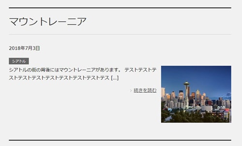
まず、賢威のデフォルトのデザインを見てみます。
以下のように1つの記事に多くのスペースを使っていて、記事の抜粋文と、「続きを読む」というリンクボタンが配置されています。
さらに、画面伸縮時のフォントサイズや余白を微調整させるために、
先程書いたbase.cssの後に以下を追記。
個人的な感想ですが、ブログ記事の抜粋文を読んでいる人はほとんど居ないと思いますし、
スペースの無駄使いだと思うので消した方がいいですね。
それと、記事一覧は「より多くの記事を読者に紹介する為のページ」なので、1つの記事に対する情報量を少なくコンパクトにして、1画面に表示させる記事数を多くするのがベストかと思います。
記事の抜粋文を削除して記事一覧をコンパクトにまとめる(PC表示)
base.cssに以下を追記
@media (min-width:737px){
    /*カテゴリータグを日付と横並び*/
    .home .article-header::after,
    .category .article-header::after,
    .archive .article-header::after{
        content: "";
        display: block;
        clear: both;
    }
    .home .article-header .post-date,
    .category .article-header .post-date,
    .archive .article-header .post-date{
        float:left;
        margin-top: 20px;
    }
    .home .article-header .post-cat,
    .category .article-header .post-cat,
    .archive .article-header .post-cat{
        float:none;
        margin-left:100px;
        margin-top: 20px;
    }
    /*記事抜粋を非表示*/
    .home .article-body p,
    .category .article-body p,
    .archive .article-body p{
        display: none;
    }
    /*記事タイトルとサムネイルの位置替え*/
    .home .article-header,
    .category .article-header,
    .archive .article-header{
        float:right;
        padding-left: 2%;
        width: 75%;
        -mox-box-sizing: border-box;
        -webkit-box-sizing: border-box;
        box-sizing: border-box;
    }
    .home .article-body,
    .category .article-body,
    .archive .article-body{
        float:left;
        width: 25%;
    }
    /*記事タイトルの調整*/
    .home .article-header .section-title,
    .category .article-header .section-title,
    .archive .article-header .section-title{
        margin: 0;
        padding: 5px 0;
        font-size: 1.2em;
        border-top: none;
    }
    .home .article-header .section-title a:hover,
    .category .article-header .section-title a:hover,
    .archive .article-header .section-title a:hover{
        text-decoration: none;
    }
}
1行目のメディアクエリの指定。
賢威7の2カラムレイアウトでは、737px以上がPC表示という仕様なので、メディアクエリでサイズを指定。
24行目~28行目で記事の抜粋文を非表示にしています。
functions.phpから記事抜粋のソースそのものを削除するという方法もあるのですが、初心者の方はできるだけ元テーマを編集したくないと思うので、今回は子テーマのCSSだけで非表示にする方法を実施しています。
CSSで見えなくしているだけなので安全ですし、将来的に賢威の新しいバージョンに替えても、記事抜粋の非表示を維持できるというメリットがあります。
44行目で
画像の表示領域を常に全体の25%に固定。これにより、表示領域をコンパクト化しています。
さらに、画面サイズ伸縮時のフォントサイズや余白の微調整を行う為に
base.cssに以下を追記してください。
@media (min-width:737px) and (max-width:834px){
    /*記事タイトルの調整*/
    .home .article-header .section-title,
    .category .article-header .section-title,
    .archive .article-header .section-title{
        font-size: 0.9em;
    }
    /*更新日時*/
    .home .article-header .post-date,
    .category .article-header .post-date,
    .archive .article-header .post-date{
        margin-top: 10px;
        font-size: 0.8em;
    }
    /*更新日時*/
    .home .article-header .post-cat,
    .category .article-header .post-cat,
    .archive .article-header .post-cat{
        margin-top: 10px;
        font-size: 0.7em;
    }
}
@media (min-width:835px) and (max-width:1100px){
    /*記事タイトルの調整*/
    .home .article-header .section-title,
    .category .article-header .section-title,
    .archive .article-header .section-title{
        font-size: 1em;
    }
    /*更新日時*/
    .home .article-header .post-date,
    .category .article-header .post-date,
    .archive .article-header .post-date{
        margin-top: 10px;
        font-size: 0.8em;
    }
    /*更新日時*/
    .home .article-header .post-cat,
    .category .article-header .post-cat,
    .archive .article-header .post-cat{
        margin-top: 10px;
        font-size: 0.8em;
    }
}
これらのCSSを反映させた画面が以下になります。
(クリックすると大きくなります)
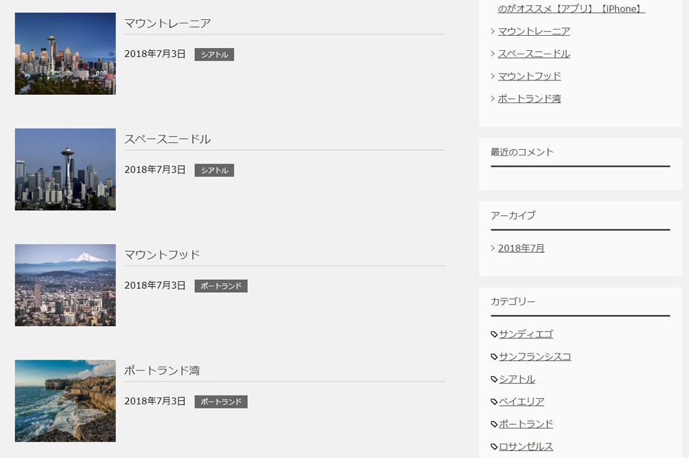
長いタイトルを入力した場合は改行されます。
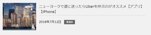
複数のカテゴリーを付加した場合は、更新日時の右横に追加されていきます。
これで完成というわけではありません。
このカスタマイズは、あくまで最低限の配置換えに留めています。
記事の抜粋文を削除して記事一覧をコンパクトにまとめる(スマホ表示)
スマホ表示の「記事の抜粋文」を消していきます。
rwd.cssに以下を追記
@media (max-width:736px){
    /*記事抜粋を非表示*/
    .home .article-body p,
    .category .article-body p,
    .archive .article-body p{
        display: none;
    }
    /*カテゴリータグを日付と横並び*/
    .home .article-header::after,
    .category .article-header::after,
    .archive .article-header::after{
        content: "";
        display: block;
        clear: both;
    }
    .home .article-header .post-date,
    .category .article-header .post-date,
    .archive .article-header .post-date{
        float:left;
    }
    .home .article-header .post-cat,
    .category .article-header .post-cat,
    .archive .article-header .post-cat{
        float:none;
        margin-left:135px;
    }
}
1行目で、賢威のスマホ表示サイズ「736px以下」を指定。
2行目~7行目で、記事の抜粋文を非表示にしています。
8行目~26行目で、「更新日時」の右横に「カテゴリー」タグを配置して、一覧の縦幅をコンパクト化。
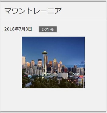
このCSSを反映させた画面が以下です。
これらのカスタマイズは、最低限のレイアウト変更を施しただけなので、
これが完成というわけではありません。
フォントの色や余白など、改善の余地がたくさんあります。
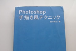
サイトデザインのカスタマイズ方法について知りたい方は、以下の書籍で勉強する事をおすすめします。
サイトのレイアウトに必要なテクニックが一通り書いてありますよ。

スポンサーリンク |
|
|
|
|