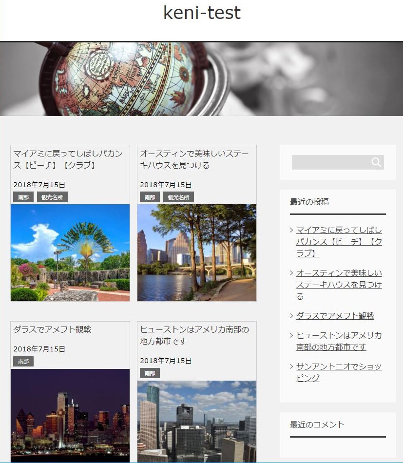
賢威7.1の記事一覧(ブログのトップ画面)をカード型にカスタマイズします。
賢威7.1クール版を元にして、base.cssにコードを貼り付けるだけ。簡単にカード型が作成できます。
以下のように最低限の形だけ整えており、カスタマイズの余地を多く残しています。
(クリックすると大きくなります)

当サイトは、読者が参考にする為のソースを提供するものです。
コピペされる方は自己責任でお願いします。(当サイトは責任を持ちません)
カード型の記事一覧【仕様】
賢威7.1の2カラムサイトは、ブラウザの横幅が736px以下の場合はスマホ表示。737px以上がPC表示。という仕様になっています。今回は、スマホ表示のデザインはそのままで、PC表示のみに3つのブレイクポイントを置いてレイアウト変更しました。
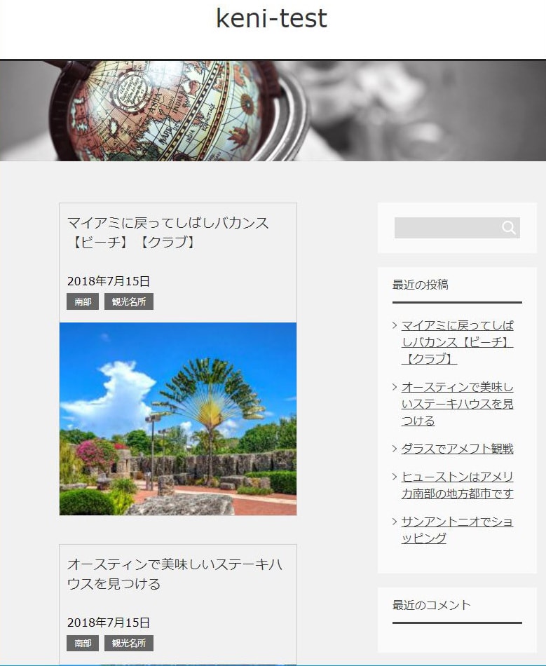
ブラウザの横幅:737px~810px
- カードは1列で表示。
- 記事タイトルのフォントサイズは1.2em。日付とカテゴリーのフォントサイズは1em。
- サムネイル画像は横幅:340px
サムネイル画像のサイズが小さい場合、自動的に340pxにまで引き伸ばして表示されます。
画質を気にされる方はサムネイルのサイズを横幅340pxに設定しておく必要があります。
以下、クリックすると大きくなります。
ブラウザの横幅:811px~1229px
- カードは2列で表示。
- 記事タイトルのフォントサイズは1em。日付とカテゴリーのフォントサイズは0.9em。
- サムネイル画像は横幅:246px
カードを2列にした分、横幅のスペースが限られるので、
タイトルと日付とカテゴリーのフォントサイズを1回り小さくしました。
以下、クリックすると大きくなります。
ブラウザの横幅:1230px~
- カードは2列で表示。
- 記事タイトルのフォントサイズは1.2em。日付とカテゴリーのフォントサイズは1em。
- サムネイル画像は横幅:340px
カードは2列表示ですが、
フォントサイズやサムネイル画像の横幅は、カード1列表示の時と全く同じです。
以下、クリックすると大きくなります。
base.cssに貼り付けるだけで記事一覧をカード型にする
base.cssに記述
/*横幅:737px以上 基本*/
@media (min-width:737px){
    /*記事抜粋を非表示*/
    .home .article-body p,
    .category .article-body p,
    .archive .article-body p{
        display: none;
    }
    /*クリアフィックス*/
    .home .main-conts:after,
    .category .main-conts:after,
    .archive .main-conts:after{
        content:"";
        display:block;
        clear:both;
    }
    /*ページネーション*/
    .float-area{
        clear:both;
    }
    /*タイトル*/
    .home .article-header .section-title,
    .category .article-header .section-title,
    .archive .article-header .section-title{
        margin: 0;
        border-top: none;
        border-bottom: none;
        padding: 4% 3%;
        font-size: 1.2em;
    }
    .home .article-header .section-title a:hover,
    .category .article-header .section-title a:hover,
    .archive .article-header .section-title a:hover{
        text-decoration: none;
    }
    /*日付*/
    .home .article-header .post-date,
    .category .article-header .post-date,
    .archive .article-header .post-date{
        margin: 0;
        padding: 4% 2% 0 3%;
        font-size: 1em;
    }
    /*カテゴリ*/
    .home .article-header .post-cat,
    .category .article-header .post-cat,
    .archive .article-header .post-cat{
        margin: 0;
        padding: 0 3% 4%;
        font-size: 1em;
    }
    /*アイキャッチ*/
    .home .article-body .eye-catch,
    .category .article-body .eye-catch,
    .archive .article-body .eye-catch{
        float:none;
        margin: 0;
    }
    .home .article-body .eye-catch img,
    .category .article-body .eye-catch img,
    .archive .article-body .eye-catch img{
        width: 100%;
        height: auto;
        vertical-align: bottom;
    }
    .home .main-conts div.section-wrap,
    .category .main-conts div.section-wrap,
    .archive .main-conts div.section-wrap{
        margin: 0;
        width: 0%;
    }
    /*記事の外側*/
    .home .main-conts article.section-wrap,
    .category .main-conts article.section-wrap,
    .archive .main-conts article.section-wrap{
        margin: 0;
        margin-bottom: 40px;
        -moz-box-sizing: border-box;
        -webkit-box-sizing: border-box;
        box-sizing: border-box;
    }
    /*記事の中身*/
    .home .main-conts article.section-wrap .section-in,
    .category .main-conts article.section-wrap .section-in,
    .archive .main-conts article.section-wrap .section-in{
        margin: 0;
        width:340px;
        border: solid 1px #cccccc;
    }
}
/*横幅:737px~810px 1列*/
@media (min-width:737px) and (max-width:810px){
    /*記事の外側*/
    .home .main-conts article.section-wrap,
    .category .main-conts article.section-wrap,
    .archive .main-conts article.section-wrap{
        width: 100%;
        float: none;
    }
    /*記事の中身*/
    .home .main-conts article.section-wrap .section-in,
    .category .main-conts article.section-wrap .section-in,
    .archive .main-conts article.section-wrap .section-in{
        margin-left: auto;
        margin-right: auto;
    }
}
/*横幅:811px~ 2列*/
@media (min-width:811px){
    /*記事の外側*/
    .home .main-conts article.section-wrap,
    .category .main-conts article.section-wrap,
    .archive .main-conts article.section-wrap{
        width: 50%;
        float:left;
    }
    /*記事の中身*/
    .home .main-conts article.section-wrap .section-in,
    .category .main-conts article.section-wrap .section-in,
    .archive .main-conts article.section-wrap .section-in{
        margin-left: auto;
        margin-right: auto;
    }
    /*
    * home
    ***********/
    /*2列改行*/
    .home .main-conts article.section-wrap:nth-child(odd){
        clear: both;
    }
    /*
    * category
    ***********/
    /*2列改行*/
    .category .main-conts article.section-wrap:nth-child(odd){
        clear: both;
    }
    /*
    * archive
    ***********/
    /*2列改行*/
    .archive .main-conts article.section-wrap:nth-child(odd){
        clear: both;
    }
}
/*横幅:811px~1229px レイアウト「小」*/
@media (min-width:811px) and (max-width:1229px){
    /*タイトル*/
    .home .article-header .section-title,
    .category .article-header .section-title,
    .archive .article-header .section-title{
        padding: 2% 2%;
        font-size: 1em;
    }
    /*日付*/
    .home .article-header .post-date,
    .category .article-header .post-date,
    .archive .article-header .post-date{
        padding: 4% 2% 0 2%;
        font-size: 0.9em;
    }
    /*カテゴリ*/
    .home .article-header .post-cat,
    .category .article-header .post-cat,
    .archive .article-header .post-cat{
        padding: 0 2%;
        font-size: 0.9em;
    }
    /*アイキャッチ*/
    .home .article-body .eye-catch img,
    .category .article-body .eye-catch img,
    .archive .article-body .eye-catch img{
        width: 100%;
        height: auto;
        vertical-align: bottom;
    }
    /*記事の中身*/
    .home .main-conts article.section-wrap .section-in,
    .category .main-conts article.section-wrap .section-in,
    .archive .main-conts article.section-wrap .section-in{
        width:246px;
        border: solid 1px #cccccc;
    }
}
上記のコードは賢威7.1のデフォルトのデザインから作成したものです。
子テーマの何も書かれていないbase.cssをカスタマイズする人に向けて作ったものなので、
既にカスタムされたbase.cssに追記すると色々とレイアウトが崩れることが想定されます。
そういう方は、コピペするのをやめて参考にする程度にしておいてください。
カード型にするコードの説明
3行目~81行目
基本となるカード型の形を作っています。
賢威デフォルトのデザインをクリアするところから始まります。
いろいろなセレクターにmargin:0を設定して元デザインのクリアしてからカード型を形成。
87行目
サムネイル画像のサイズを340pxに設定。
340pxがそのままカードの横幅サイズになります。
91行目~107行目
カード型の1列表示。
108行目~145行目
カード型の2列表示。
146行目~183行目
カード型2列用の小さいフォント、サムネイル246pxの設定。
さらにカスタマイズする
上記のbase.cssは、カード型にする為の最低限のレイアウト変更を施しただけなので、
完成ではありません。
デザインのカスタマイズの方法を勉強したい方は、以下の書籍を強くおすすめします。

レイアウト変更を勉強したい方は、以下の書籍がおすすめです。
サイトのレイアウト変更に必要なテクニックは大体この本に書いてありますよ。

スポンサーリンク |
|
|
|
|